Keynote Color Palette Customized
In-depth tutoiral on changing your Keynote color themes
 ⟶
⟶
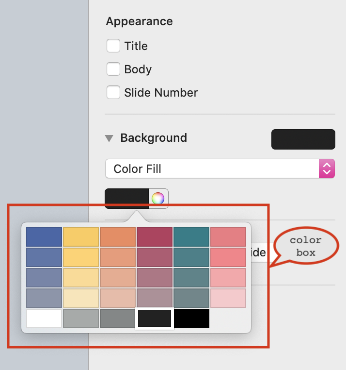
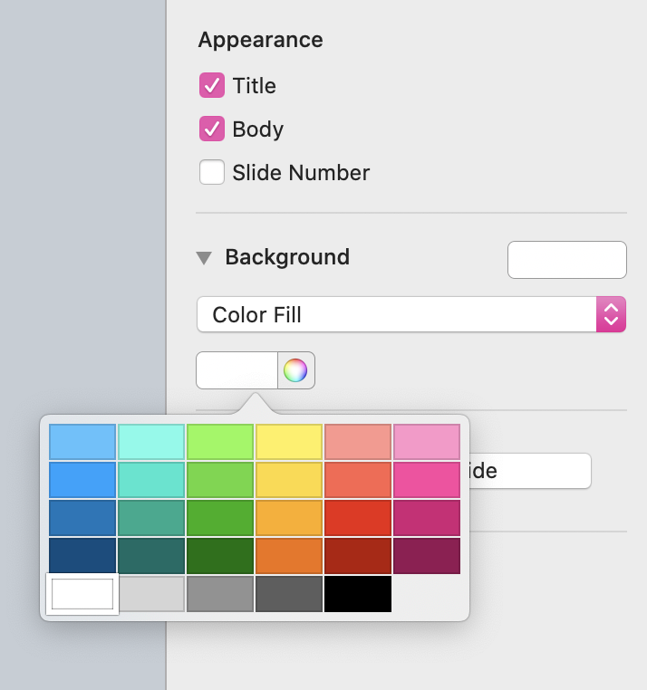
This tutorial shows you how to customize the color palette in Keynote (how to go from left to right in the above figure). Apparently, this is more complicated than it sounds. If you want to create your own Keynote theme, you also want to create an accompanying color palette. This involves generating the color gradients and placing these colors into Keynote's color box (annotated in red).
First, why is it useful?
While this blog is not about finding the best color palette for aesthetic purposes, I'd recommend Coolors, a webiste that gives you inspiration about colors, and helps you generate color palettes. I used this website to create the gradient color palette you see on the top. Now with this website in hand, let's walk through how to customize Keynote color palette step by step.
Step 1: Select 6 colors as your palette basis.
You can do this in any form from any resource. It's an artistic choice and it's all your call. The number 6 here is because Keynote supports 6-color palette, as you see in the color box shown above. I usually browse over Coolors's random color generator to get inspired, and some of my favorite color palettes (for making slides) are here. I like the ones with slightly lower saturation so that the color won't take over the main messages of my slides.
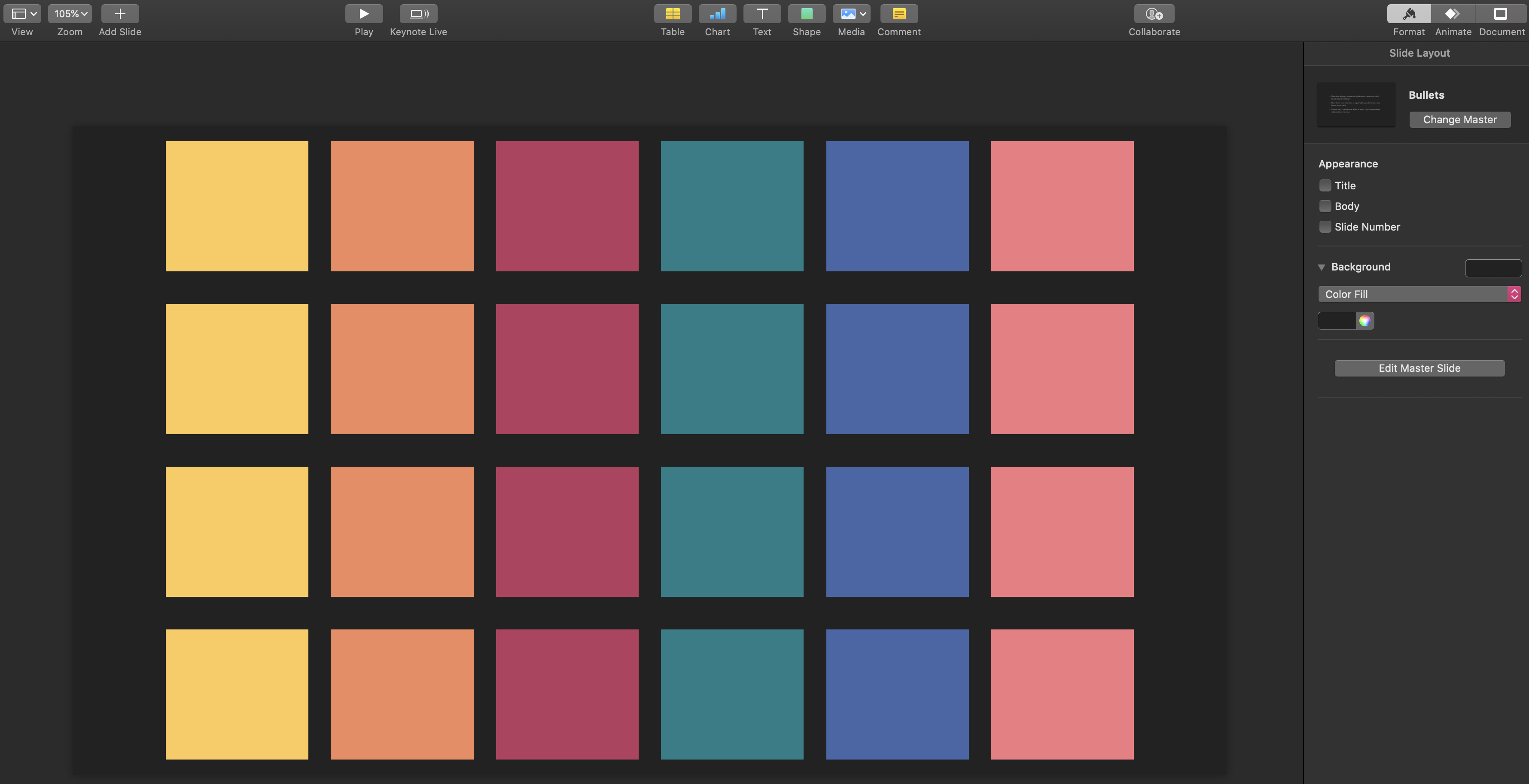
Step 2: Inside Keynote, create 6 by 4 square shapes colored by these 6 palette basis.
Now the tedious part begins. For each of the 6 basis colors, we will create 4 gradients -- inherent to how Keynote color box supports.
Step 3: Generate color gradients using Coolors's gradient palette tool.
With Coolors's gradient palette tool, generate the 4 gradient colors for each of the basis. I often use the Hex # to copy the colors from Keynote into Coolors. Then, we either fix the start color or the end color and decide the other end by increasing or decreasing the saturation. Here's the process in action:
Step 4: Inside Keynote, color the rest of shapes with the generated color gradients.
The cool thing about Coolors is that you can directly copy the Hex numbers of the generated gradient colors and put them into Keynote to color your squares. You do it for all the 6 basis colors, and here's how it looks like for one illustration:
Step 5: Inside Keynote, drag these colors into Keynote's color box.
Now we have all the basis colors and their gradients filled up. We need to finally drag these colors to our color box! This step is straightforward with a video illustration so I won't spend words on it. Here you go:
My personal experience with Keynote
I've been using Keynote to make my conference talks, lecture slides, academic paper figures and even videos (with its "slide recording" tool). Sometimes people thought the videos were made by some specializied software. Nope, it's all Keynote! Some of the examples can be found here:
Originally, it was my adviser, Ren, who brought me into the magic world of Keynote. Once he said "I would keep using a Macbook because of Keynote, and because of the `Magic Move` in Keynote."
"Magic Move" is a cool animation technique in Keynote that creates the effect of objects moving from their positions on one slide to new positions on the next slide when you play your presentation. I use this effect in almost every presentation, because it is so neat and effective in guiding the viewers' gaze and attention. Here's an example:
Hope you're convinced that Keynote is aesthetically pleasing for slide creation and that us researchers should learn how to make good slides! After all, we've worked so hard on each project, why not present its best form to others?